Wild Roses
Brand identity, Typography, Graphic Design, Packaging Design.
Brand identity, Typography, Graphic Design, Packaging Design.
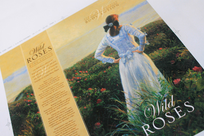
Designingpackaging that would appropriately complement the artwork of John Philip Hagenwas the real goal of this project. Using a carefully grown version of theimage, the hues of the sky were extended to contain the main text of thedesign. Serlio was used to produce a feeling of elegance, and Edwardian Scriptfor the word ‘Wild’ facilitated an additional identity feature. A singular ‘W’ was‘watermarked’ behind the product descriptor and embossed onto the luxury soap.